How Can You Apply the Three Principles of Micro-learning?
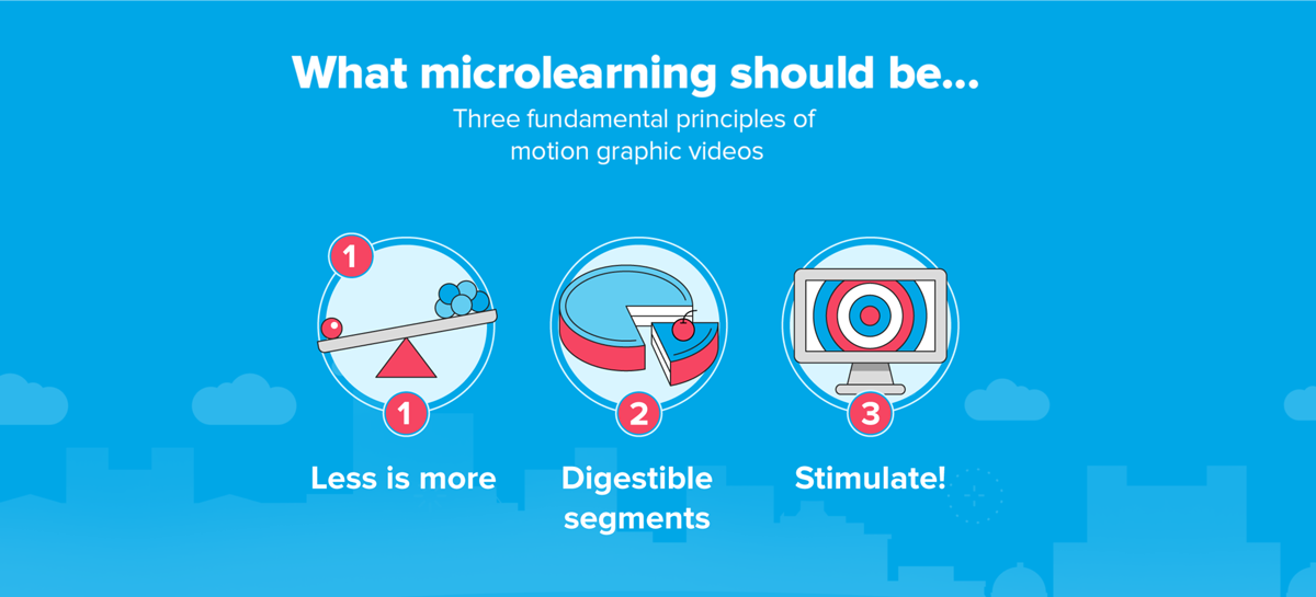
Principle One: Less is More
Feb 22nd, 2017
Tugrul Turkkan
Micro learning, Distracted learner, Less is more, Case Study, Metaphor
2 min read
In my previous blog post, I stated that the digital age has created “the distracted learner”. Studies show that attention spans are falling and making it harder for people to learn something presented digitally longer than, say, 5 minutes.
If the learners are distracted so easily, then the content developers need to find a way to make content that is “light on minutes” but “heavy on content” for learners.
Thus I introduce you to the first principle of microlearning: Less is More.
This principle can be defined as a process of short learning activities with carefully designed bits of content that will reduce the cognitive load on the learners.
Here is a case study that shows how you can apply this principle in corporate training:
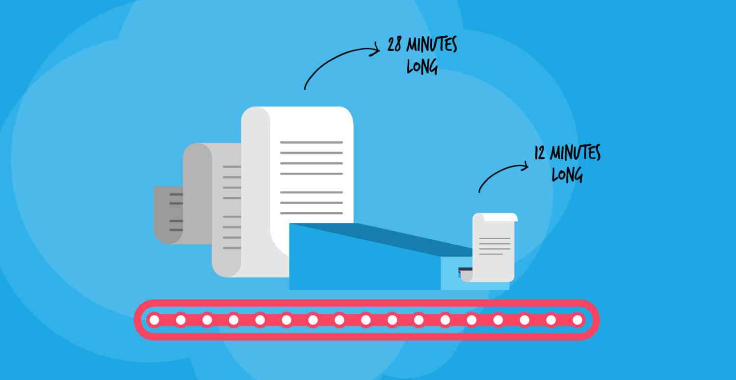
A private bank gave us the assignment of shrinking their cyber security training video for new employees. Their existing content, which is 28 minutes and screen-based, is so long and so detailed that most people do not complete the training no matter how hard they are pushed. The completion rate of the training is just 38%.
We analyzed the content with their business unit and then asked ourselves a simple question, “how to tell it in 600 words?”.

That’s what we call The Twitter Approach. Just like how Twitter forces tweets to be a certain character limit, an instructional designer can force themself to stick to a certain video time duration.
This can be done by removing repetitive information, fillers, and irrelevant data. Every piece of content has things that can be cut out because people tend to add more and more to the content to explain their point but remember: Less is more!
“You have achieved perfection not when there is nothing left to add, but when there is nothing left to take away.”
When a learning professional sits at her desk and starts to plan a training, she should imagine the cognitive capacity to digest information of her learner not like a tabula rasa with unlimited pages, but like a billboard with limited space.

A successful lawyer once said, “If you argue ten points, even if each point is really good, when the jurors get back to the jury room they won’t remember any of those points. There are just too many”. So things have to be made simple.
For a reference, you can read Chip and Dan Heath’s popular book Made to Stick. Right in the first chapter “Simple”, it is better to have more simple valuable information then a lot of it.
Another way to simplify complex information is using «metaphoric animations» which is what we at Vibons often use in our motion graphics videos.
«Less is More» is more than just removing the least important data; it is also “Less Words & More Visuals”. Applying metaphoric animations is one of the best ways to compress the information and improve retention.
Read this chunk of information as an example:
“Vibons is a community based platform that attracts both talented creative designers and learning professionals throughout the world.”
Normally, it takes 5 seconds to comprehend this sentence for an average learner. So how can we apply an animated metaphor? Think attract as a magnet, a good analogy for instruction designers is a graduation cap, and for creative designers a megaphone, which is the common symbol of marketing. By adding these visual cues, the end result is more visual, shorter and simplified.

This animated metaphor now takes just 2 seconds to comprehend. If you can find the right image that successfully conveys the idea to the learner, you need fewer words to explain it.
Moreover, another point is that these highly structured animations stimulate the learner to understand one concept in terms of another. Since you connect the auditory and the visual, it would be easier for the learner to retain the information.
After filtering, the private bank’s content is reduced from 28 minutes to 12 minutes. But it’s still too long. The aim is for 600 words which is approximately 4 minutes. I’ll discuss how we can apply the second principle (“cut to digestible segments”) in my next blog.
---
About the Author: Tugrul Turkkan is the founder and CEO of Vibons, a community based animation platform focused on corporate learning and communication.